
Making an Androidy Android app for vinspired
Last year we made a well-received iPhone app for vinspired. The idea behind the app was to make it even easier for young volunteers to find volunteering opportunities and to document their activity and to share it with the world. We recently started work on an updated version of that app – look out for it in the App Store in the next few weeks – but we haven't been idle in the intervening time. Today, vinspired are announcing BlackBerry and Android versions of the app at ND11.
The cliché is that good design is something you expect to find on iOS, but that Android apps are functional at best, or fundamentally ugly at worst. If you listen to Apple fans, you'll hear about a lack of design standards and a general lack of appetite for design in the Android developer community. Many developers seem to think that the way to combat this problem is to port the functionality *and* the look and feel from the iOS version of their app.
We disagree. We spent a good deal of time looking at Google's own documents on how to design for Android (yes, they do exist), and trying to understand the way designers and developers had interpreted these guidelines in apps. One very useful resource we found was Android Patterns, but no one source is going to provide all of answers. Immersing yourself in the world of Android is the only way, scary as that sounds to an iPhone user.
After our research, we quickly moved on to sketching up some ideas of how to interpret what we had learned specifically for vinspired, and then worked these up into higher fidelity PSDs.
But enough talk. Here's the homescreen of the app, side by side with the iPhone version:
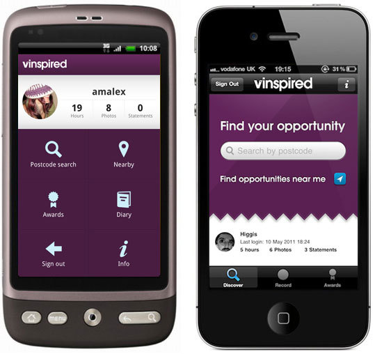
This is what the Android SDK calls a 'Dashboard'. Rather than port the iOS tab bar to Android, this is the recommended way to present a number of different sections of the app to the user. The screen has all of the same information on it, but it's been reinterpreted in an appropriate way for the platform.
Here's the search results page, again side by side with its iOS counterpart:

Here, we've used the Android action bar to allow the user to switch quickly between different search options. There's no need for a back button because Android has a hardware button for going back, which works not just within an application, but between different applications as well.
This feature allows for much better integration between applications than is currently possible on iOS. One way we've taken advantage of this is to provide driving directions from your current location to the volunteering opportunity using the built in Android navigation software. A simple tap of the back button takes you straight back into the app. I've lost count of the Android apps I've seen that reimplement the iOS software back button rather than using the built in hardware button, but I can't help but feel that this entirely misses the point.
There are a hundred other decisions we made along the way, and these are merely intended as a taster. We'll be talking more about the specific design decisions we made in due course.
We had a great time creating this app, and I think that really started from the decision to make an app that embraced the platform fully. An early prototype followed the iOS design much more closely, and while we gained a lot of useful code that made it into production, it was crystal clear that we'd need to do a lot of work to make it feel like a proper Android app, while still being easy to use and clearly part of the vinspired family of sites and apps.
We're really pleased with the way it's turned out, but we'd love to know what you think of it too. What are you waiting for? Go ahead and download it from the Android market now!